

Vertical navigational menu bar with bootstrap
To create a vertical navigation menu bar using Bootstrap, you can utilize the built-in Bootstrap classes and components. Here's an example of how you can achieve this:
html
<!DOCTYPE html>
<html lang="en">
<head>
<meta charset="UTF-8">
<meta name="viewport" content="width=device-width, initial-scale=1.0">
<!-- Bootstrap CSS -->
<link rel="stylesheet" href="https://cdn.jsdelivr.net/npm/bootstrap@5.1.0/dist/css/bootstrap.min.css">
<title>Vertical Navigation Menu</title>
<style>
    /* Set a fixed height for the sidebar */
    .sidebar {
        height: 100vh;
    }
</style>
</head>
<body>
<div class="container-fluid">
    <div class="row">
        <!-- Sidebar -->
        <div class="col-md-3 sidebar bg-light">
            <ul class="nav flex-column">
                <li class="nav-item">
                    <a class="nav-link active" href="#">Home</a>
                </li>
                <li class="nav-item">
                    <a class="nav-link" href="#">About</a>
                </li>
                <li class="nav-item">
                    <a class="nav-link" href="#">Services</a>
                </li>
                <li class="nav-item">
                    <a class="nav-link" href="#">Contact</a>
                </li>
            </ul>
        </div>

        <!-- Content -->
        <div class="col-md-9">
            <h1>Page Content</h1>
            <p>Lorem ipsum dolor sit amet, consectetur adipisicing elit. Placeat expedita iste,
            beatae harum doloribus quidem quam fugit, rem tempore tenetur dolores illo distinctio
            porro eius, laboriosam ratione possimus veritatis vero.</p>
        </div>
    </div>
</div>

<!-- Bootstrap JS -->
<script src="https://cdn.jsdelivr.net/npm/bootstrap@5.1.0/dist/js/bootstrap.bundle.min.js"></scri
pt>
</body>
</html>
In this example, the navigation menu is created within a Bootstrap grid layout. The sidebar column (`.col-md-3`) contains an unordered list (`<ul>`) with each list item (`<li>`) representing a menu item. You can add more menu items by adding additional list items with anchor tags (`<a>`) inside.
The `bg-light` class is used to give the sidebar a light background color. You can change it to any other Bootstrap background color class as per your preference.
The content area is represented by the second column (`.col-md-9`) where you can add your page content.
Make sure to include the necessary Bootstrap CSS and JavaScript files by adding the respective CDN links in the `<head>` section.
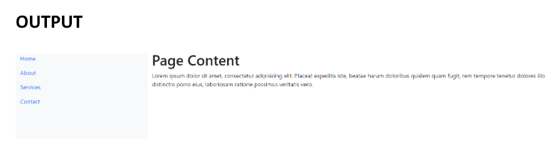
Output:
About the Author

Silan Software is one of the India's leading provider of offline & online training for Java, Python, AI (Machine Learning, Deep Learning), Data Science, Software Development & many more emerging Technologies.
We provide Academic Training || Industrial Training || Corporate Training || Internship || Java || Python || AI using Python || Data Science etc


PreviousNext
Join our newsletter for the latest updates.
About us
Our Services
Contact Us
Our Courses
Learn Python | Learn AI | Learn Machine Learning | Learn Deep Learning | Learn Core Java | Learn Java JSP | Learn Java Servlet | Learn Java Spring Core | Learn Spring Boot | Learn Power BI | Learn DAA | Learn HTML | Learn SQL | Learn C Programming | Learn Bootstrap | Learn Git | Learn JavaScript | Learn Data Structure Using C | Learn RDBMS | Learn Data Science | Learn PHP
Our Tutorials
Python Tutorial | AI Tutorial | Machine Learning Tutorial | Deep Learning Tutorial | Core Java Tutorial | Java JSP Tutorial | Java Servlet Tutorial | Java Spring Tutorial | Spring Boot Tutorial | Power BI Tutorial | DAA Tutorial | HTML Tutorial | SQL Tutorial | C Programming Tutorial | Bootstrap Tutorial | Git Tutorial | JavaScript Tutorial | Data Structure Using C Tutorial | RDBMS Tutorial | Data Science Tutorial | PHP Tutorial
Copyright © 2023 Pythontpoint Powered by Silan Software Pvt. Ltd. All rights reserved.