

Data Visualization with Python
In [ ]:
# Libraries to help with reading and manipulating data
import numpy as np
import pandas as pd
import matplotlib.pyplot as plt
import seaborn as sns
# Command to tell Python to actually display the graphs
%matplotlib inline
In [ ]:
df = pd.read_csv('Automobile (1).csv')
# df = pd.read_csv('/location on your computer/Automobile (1).csv')
In [ ]:
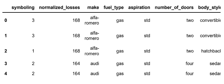
df.head()Out[4]:
In [ ]:
df.shapeOut[5]:
(201, 26)
• The data has 201 rows and 26 columns.
In [ ]:
df.info()<class 'pandas.core.frame.DataFrame'>
RangeIndex: 201 entries, 0 to 200
Data columns (total 26 columns):
# Column Non-Null Count Dtype
--- ------ -------------- -----
0 symboling 201 non-null int64
1 normalized_losses 201 non-null int64
2 make 201 non-null object
3 fuel_type 201 non-null object
4 aspiration 201 non-null object
5 number_of_doors 201 non-null object
6 body_style 201 non-null object
7 drive_wheels 201 non-null object
8 engine_location 201 non-null object
9 wheel_base 201 non-null float64
10 length 201 non-null float64
11 width 201 non-null float64
12 height 201 non-null float64
13 curb_weight 201 non-null int64
14 engine_type 201 non-null object
15 number_of_cylinders 201 non-null object
16 engine_size 201 non-null int64
17 fuel_system 201 non-null object
18 bore 201 non-null float64
19 stroke 201 non-null float64
20 compression_ratio 201 non-null float64
21 horsepower 201 non-null int64
22 peak_rpm 201 non-null int64
23 city_mpg 201 non-null int64
24 highway_mpg 201 non-null int64
25 price 201 non-null int64
dtypes: float64(7), int64(9), object(10)
memory usage: 41.0+ KB• There are attributes of different types (int, float, object) in the data.
In [ ]:
df.describe(include='all').TOut[7]:
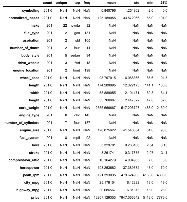
• The car price ranges from 5118 to 45400 units.
• The car weight ranges from 1488 to 4066 units.
• The most common car make in the data is of Toyota.
Histogram
• A histogram is a univariate plot which helps us understand the distribution of a continuous numerical variable.
• It breaks the range of the continuous variables into a intervals of equal length and then counts the number of observations in each interval.
• We will use the histplot() function of seaborn to create histograms.
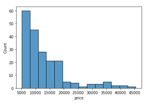
In [ ]:
sns.histplot(data=df, x='price')Out[8]:
<AxesSubplot:xlabel='price', ylabel='Count'>
Let's see how we can customize a histogram.
In [ ]:
plt.title('Histogram:Price')
plt.xlim(3000,50000)
plt.ylim(0,70)
plt.xlabel('Price of cars')
plt.ylabel('Frequency')
sns.histplot(data=df, x='price',color='orange');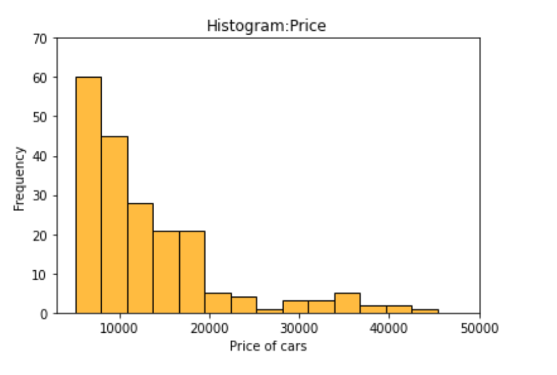
We can specify the number of intervals (or groups or bins) to create by setting the bins parameter.
• If not specified it is passed to numpy.histogram_bin_edges() (https://numpy.org/doc/stable/reference/generated/numpy.histogram_bin_edges.html#numpy.histogram_b
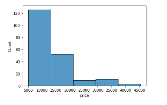
In [ ]:
sns.histplot(data=df, x='price', bins=5)Out[10]:
<AxesSubplot:xlabel='price', ylabel='Count'>
In [ ]:
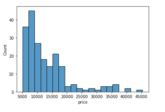
sns.histplot(data=df, x='price', bins=20)Out[11]:
<AxesSubplot:xlabel='price', ylabel='Count'>
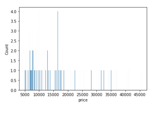
If we want to specify the width of the intervals (or groups or bins), we can use binwidth parameter.
In [ ]:
sns.histplot(data=df, x='price', binwidth=20)Out[12]:
<AxesSubplot:xlabel='price', ylabel='Count'>
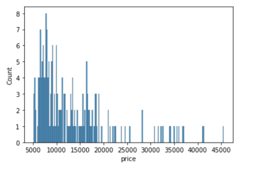
In [ ]:
sns.histplot(data=df, x='price', binwidth=200)Out[13]:
<AxesSubplot:xlabel='price', ylabel='Count'>
How to find the optimal number of bins: Rule of thumb
In addition to the bars, we can also add a density estimate by setting the kde parameter to True.
• Kernel Density Estimation, or KDE, visualizes the distribution of data over a continuous interval.
• The conventional scale for KDE is: Total frequency of each bin × Probability
In [ ]:
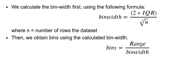
sns.histplot(data=df, x='price', kde=True);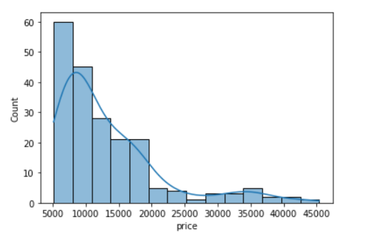
In [ ]:
sns.histplot(data=df, x='price', bins=700, kde=True);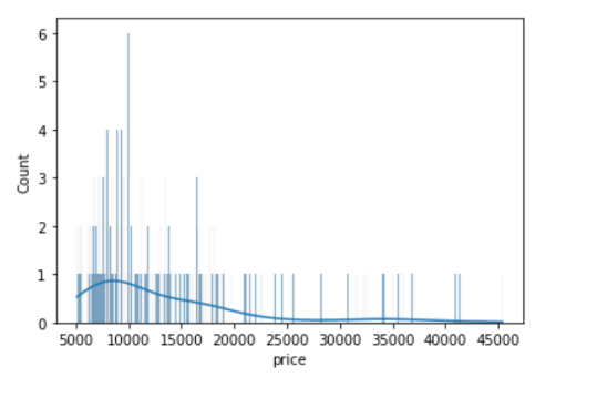
Clearly, if we increase the number of bins, it reduces the frequency count in each group (bin). Since the scale of KDE depends on the total frequency of each bin (group), the above code gives us a flattened KDE plot.
Let's check out the histograms for a few more attributes in the data.
In [ ]:
sns.histplot(data=df, x='curb_weight', kde=True);
• A histogram is said to be symmetric if the left-hand and right-hand sides resemble mirror images of each other when the histogram is cut down the middle.
In [ ]:
sns.histplot(data=df, x='horsepower', kde=True);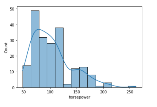
• The tallest clusters of bars, i.e., peaks, in a histogram represent the modes of the data.
• A histogram skewed to the right has a large number of occurrences on the left side of the plot and a few on the right side of the plot.
• Similarly, a histogram skewed to the left has a large number of occurrences on the right side of the plot and few on the left side of the plot.
Histograms are intuitive but it is hardly a good choice when we want to compare the distributions of several groups. For example,
In [ ]:
sns.histplot(data=df, x='price', hue='body_style', kde=True);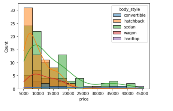
It might be better to use subplots!
In [ ]:
g = sns.FacetGrid(df, col="body_style")
g.map(sns.histplot, "price");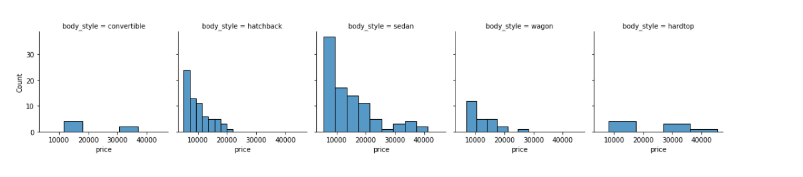
In such cases, we can use boxplots. Boxplots, or box-and-whiskers plots, are an excellent way to visualize differences among groups.
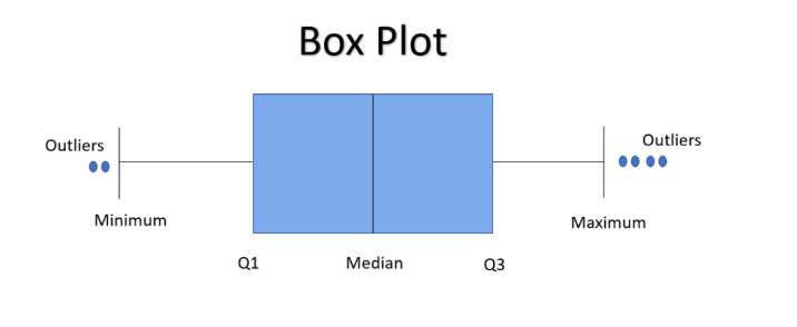
Boxplot
• A boxplot, or a box-and-whisker plot, shows the distribution of numerical data and skewness through displaying the data quartiles
• It is also called a five-number summary plot, where the five-number summary includes the minimum value, first quartile, median, third quartile, and the maximum value.
• The boxplot() function of seaborn can be used to create a boxplot.
In [ ]:
from IPython.display import Image
Image('/content/drive/MyDrive/Python Course/boxplot.png')
#Image('/location on your computer/boxplot.png')
Out[20]:
In [ ]:
# creating a boxplot with seaborn
sns.boxplot(data=df, x='curb_weight');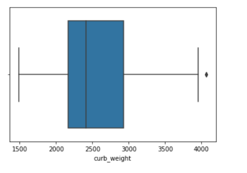
Let's see how we can customize a boxplot.
In [ ]:
plt.title('Boxplot:Horsepower')
plt.xlim(30,300)
plt.xlabel('Horsepower')
sns.axes_style('whitegrid')
sns.boxplot(data=df, x='horsepower',color='green');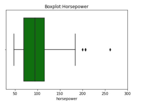
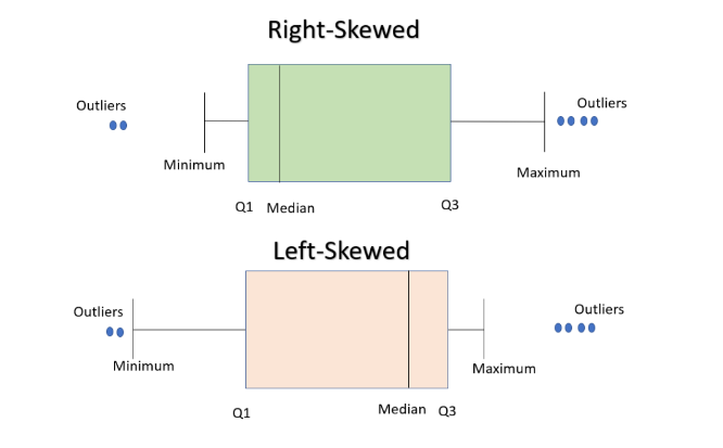
• In a boxplot, when the median is closer to the left of the box and the whisker is shorter on the left end of the box, we say that the distribution is positively skewed (skewed right).
• Similarly, when the median is closer to the right of the box and the whisker is shorter on the right end of
the box, we say that the distribution is negatively skewed (skewed left).
In [ ]:
from IPython.display import Image
Image('/content/drive/MyDrive/skew_box.png')
#Image('/location on your computer/skew_box.png')
Out[23]:
For example,
In [ ]:
sns.boxplot(data=df, x='price');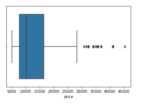
From the above plot, we can see that the distribution of price is positively skewed.
Let's see how we can compare groups with boxplots.
In [ ]:
sns.boxplot(data=df, x='body_style', y='price') ;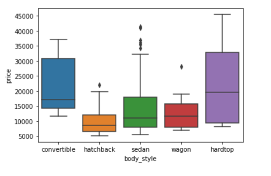
Though boxplot visually summarizes variation in large datasets, it is unable to show multimodality and clusters.
In [ ]:
sns.boxplot(data=df, x='bore');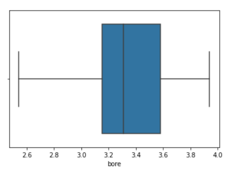
• From the above boxplot we can not tell if the data is bimodal or not, but it is clearly visible in the following histogram.
In [ ]:
sns.histplot(data=df, x='bore',kde = True);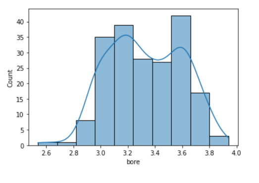
Bar Graph
• A bar graph is generally used to show the counts of observations in each bin (or level or group) of
categorical variable using bars.
• We can use the countplot() function of seaborn to plot a bar graph.
In [ ]:
sns.countplot(data=df, x='body_style');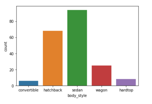
We can also make the plot more granular by specifying the hue parameter to display counts for subgroups.
In [ ]:
sns.countplot(data=df, x='body_style', hue='fuel_type');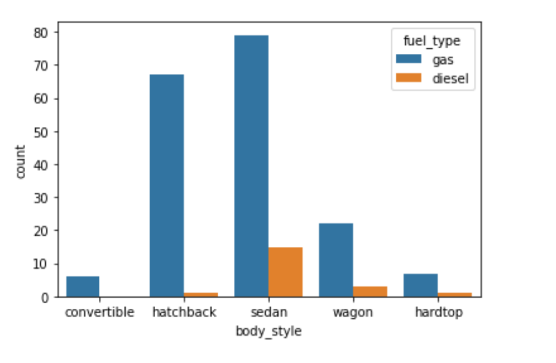
Let's check out the bar graphs for a few more attributes in the data.
In [ ]:
sns.countplot(data=df, x='make');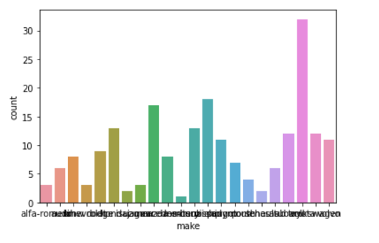
• This plot looks a little messy and congested.
• Let's increase the size of the plot to make it look better.
In [ ]:
plt.figure(figsize=(20,7))
sns.countplot(data=df, x='make');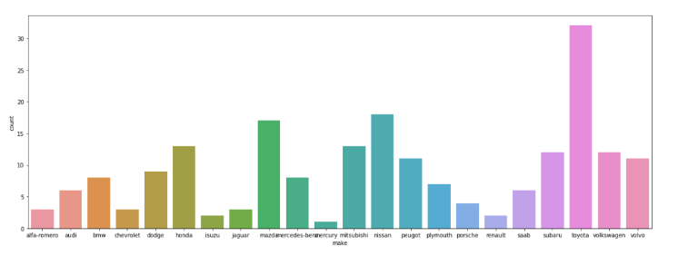
• Some of the tick marks on the x-axis are overlapping with each other.
• Let's rotate the tick marks to make it look better.
In [ ]:
plt.figure(figsize=(20,7))
sns.countplot(data=df, x='make')
plt.xticks(rotation=90)
Out[32]:
(array([ 0, 1, 2, 3, 4, 5, 6, 7, 8, 9, 10, 11, 12, 13, 14, 15, 1
6,
17, 18, 19, 20, 21]),
[Text(0, 0, 'alfa-romero'),
Text(1, 0, 'audi'),
Text(2, 0, 'bmw'),
Text(3, 0, 'chevrolet'),
Text(4, 0, 'dodge'),
Text(5, 0, 'honda'),
Text(6, 0, 'isuzu'),
Text(7, 0, 'jaguar'),
Text(8, 0, 'mazda'),
Text(9, 0, 'mercedes-benz'),
Text(10, 0, 'mercury'),
Text(11, 0, 'mitsubishi'),
Text(12, 0, 'nissan'),
Text(13, 0, 'peugot'),
Text(14, 0, 'plymouth'),
Text(15, 0, 'porsche'),
Text(16, 0, 'renault'),
Text(17, 0, 'saab'),
Text(18, 0, 'subaru'),
Text(19, 0, 'toyota'),
Text(20, 0, 'volkswagen'),
Text(21, 0, 'volvo')])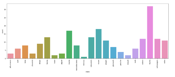
• A lot of plot-specific text has shown up in the output.
• Let's see how we can get rid of those.
In [ ]:
plt.figure(figsize=(20,7))
sns.countplot(data=df, x='make')
plt.xticks(rotation=90)
plt.show() # this will ensure that the plot is displayed without the text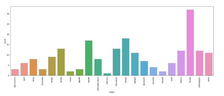
Here are some common ways to customize a barplot.
In [ ]:
plt.figure(figsize=(10,7))
plt.title('Barplot:Engine-type')
plt.ylim(0,180)
sns.countplot(data=df, x='engine_type',hue='fuel_type')
plt.xlabel('Engine-type');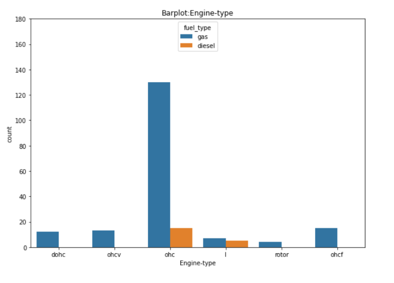
About the Author

Silan Software is one of the India's leading provider of offline & online training for Java, Python, AI (Machine Learning, Deep Learning), Data Science, Software Development & many more emerging Technologies.
We provide Academic Training || Industrial Training || Corporate Training || Internship || Java || Python || AI using Python || Data Science etc


PreviousNext
Join our newsletter for the latest updates.
About us
Our Services
Contact Us
Our Courses
Learn Python | Learn AI | Learn Machine Learning | Learn Deep Learning | Learn Core Java | Learn Java JSP | Learn Java Servlet | Learn Java Spring Core | Learn Spring Boot | Learn Power BI | Learn DAA | Learn HTML | Learn SQL | Learn C Programming | Learn Bootstrap | Learn Git | Learn JavaScript | Learn Data Structure Using C | Learn RDBMS | Learn Data Science | Learn PHP
Our Tutorials
Python Tutorial | AI Tutorial | Machine Learning Tutorial | Deep Learning Tutorial | Core Java Tutorial | Java JSP Tutorial | Java Servlet Tutorial | Java Spring Tutorial | Spring Boot Tutorial | Power BI Tutorial | DAA Tutorial | HTML Tutorial | SQL Tutorial | C Programming Tutorial | Bootstrap Tutorial | Git Tutorial | JavaScript Tutorial | Data Structure Using C Tutorial | RDBMS Tutorial | Data Science Tutorial | PHP Tutorial
Copyright © 2023 Pythontpoint Powered by Silan Software Pvt. Ltd. All rights reserved.